↑
Rebranding a world famous airline*
Why re-design something so iconic? It’s that challenge that inspired me to tackle something so daunting. The Swiss Air brand, now referred to simply as SWISS, has seen several rebrandings since its inception almost a century ago. The current branding, a direct play on the Swiss flag, paired with a bold sans serif logotype that reads “SWISS,” is both expected and frankly, a bit confusing. With so many Swiss brands using a similar aesthetic, it’s hard for the airline to stand out, or even read as an airline at a glance. I saw this as an opportunity to try something new.
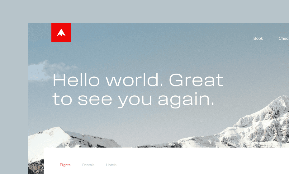
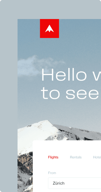
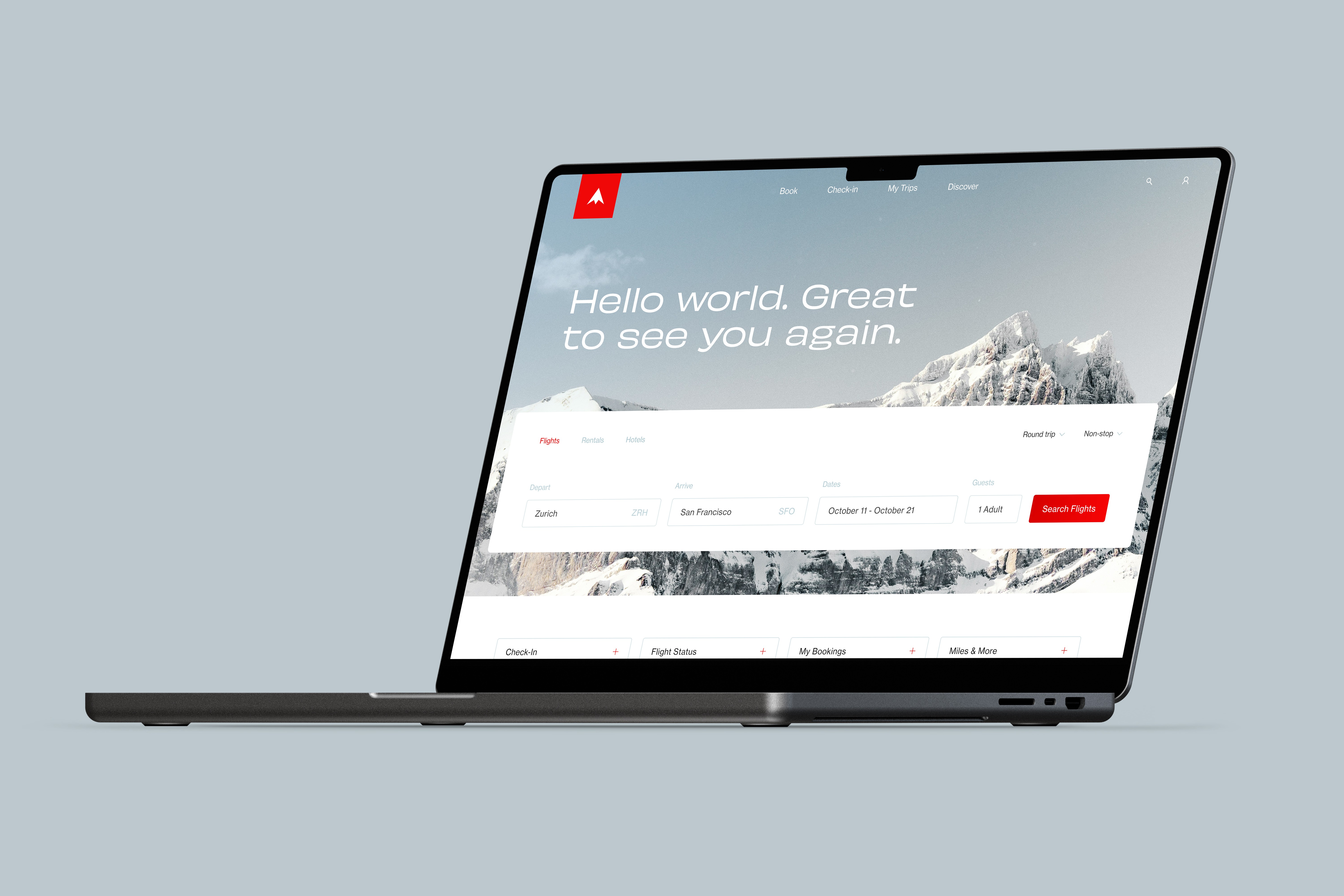
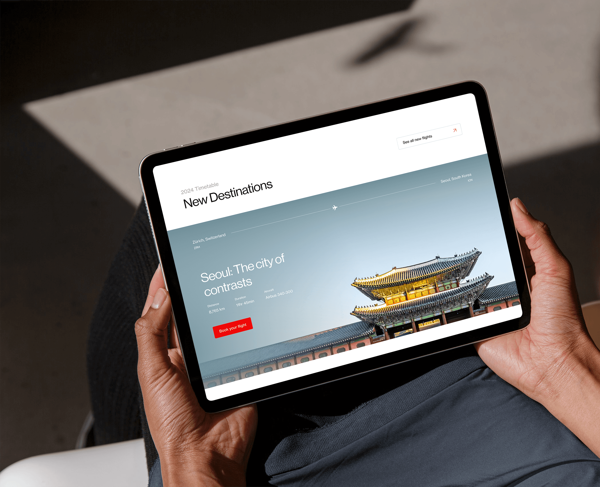
The rebrand, which includes a new logo and updated color palette, plays off one of Switzlerand’s most iconic features - the Alps.
*This is a personal project and not associated with SWISS official.
Rebranding a world
famous airline*
Why re-design something so iconic? It’s that challenge that inspired me to tackle something so daunting. The Swiss Air brand, now referred to simply as SWISS, has seen several rebrandings since its inception almost a century ago. The current branding, a direct play on the Swiss flag, paired with a bold sans serif logotype that reads “SWISS,” is both expected and frankly, a bit confusing. With so many Swiss brands using a similar aesthetic, it’s hard for the airline to stand out, or even read as an airline at a glance. I saw this as an opportunity to try something new.
The rebrand, which includes a new logo and updated color palette, plays off one of Switzlerand’s most iconic features - the Alps.
*This is a personal project and not associated with SWISS official.
Rebranding a world famous airline*
Why re-design something so iconic? It’s that challenge that inspired me to tackle something so daunting. The Swiss Air brand, now referred to simply as SWISS, has seen several rebrandings since its inception almost a century ago. The current branding, a direct play on the Swiss flag, paired with a bold sans serif logotype that reads “SWISS,” is both expected and frankly, a bit confusing. With so many Swiss brands using a similar aesthetic, it’s hard for the airline to stand out, or even read as an airline at a glance. I saw this as an opportunity to try something new.
The rebrand, which includes a new logo and updated color palette, plays off one of Switzlerand’s most iconic features - the Alps.
*This is a personal project and not associated with SWISS official.

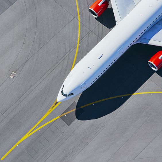





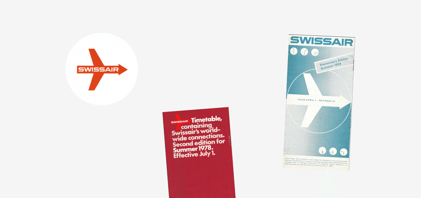
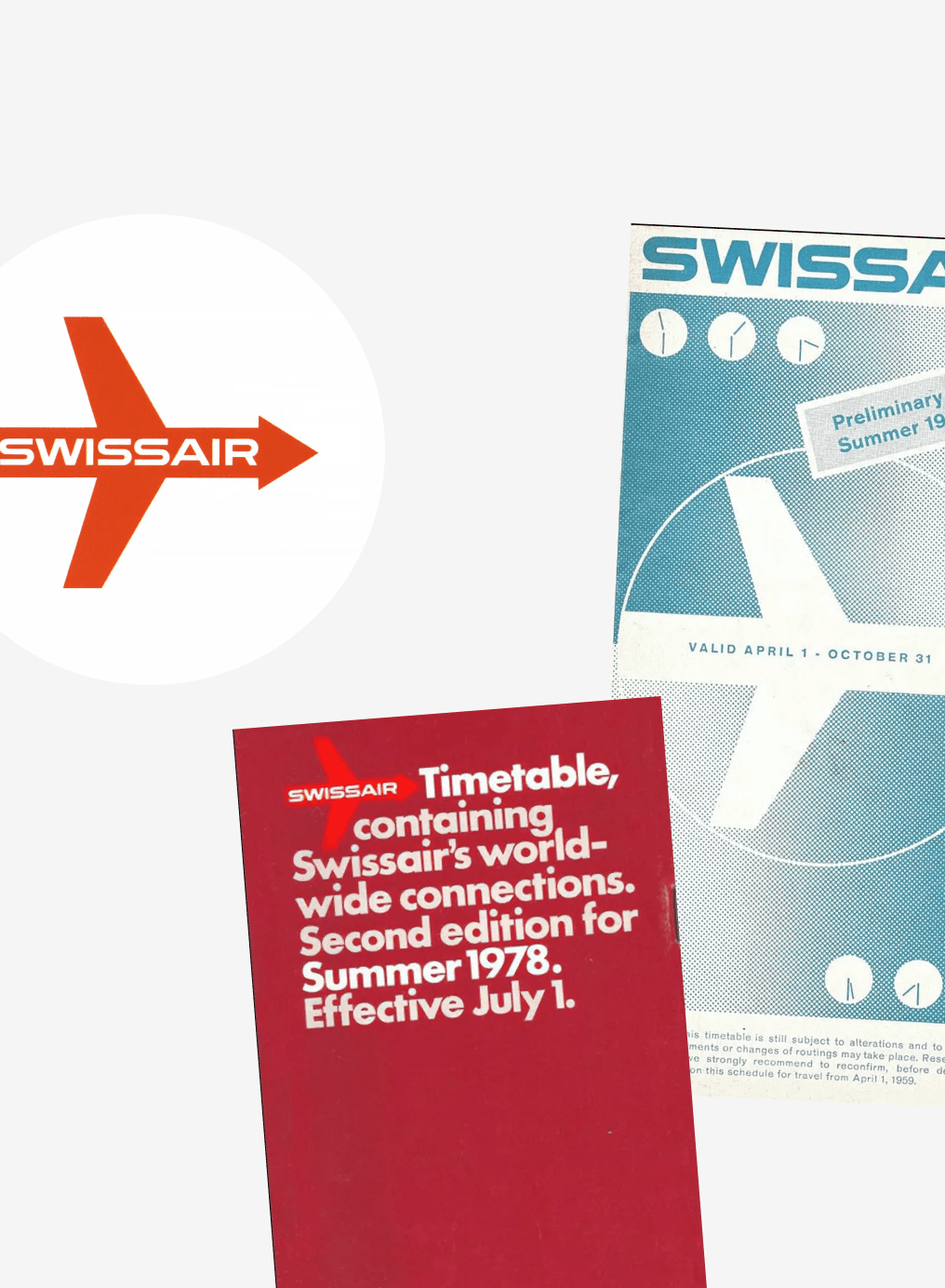
Like many rebrands, I started by looking to the past. I drew inspiration from the 1950s itteration of the brand, when wide-set text, an aerodynamic mark, and a palette of deep red paired with cool blue gradients defined its look.









↑
↑
↑
↑
↑

